In this tutorial, we'll look at the StackLayout in.NET MAUI. If you are new to.NET MAUI, I recommend that you read the following topics in this series. StackLayout is a layout that allows us to organize the child views in a one-dimensional stack horizontally or vertically. The StackLayout's default orientation is vertical, however it can be modified to horizontal.
Let's look at few instances to better grasp StackLayout.
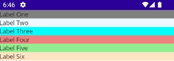
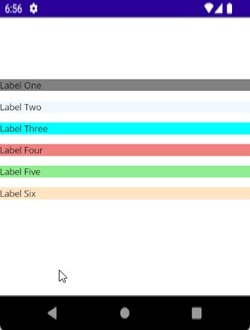
Stack layout with vertical orientation
In the first example, I added many Labels to the StackLayout and organized them vertically because the StackLayout's default orientation is 'Vertical'.
<StackLayout>
<Label x:Name="lblOne" Text="Label One" BackgroundColor="Gray"></Label>
<Label x:Name="lblTwo" Text="Label Two" BackgroundColor="AliceBlue"></Label>
<Label x:Name="lblThree" Text="Label Three" BackgroundColor="Aqua"></Label>
<Label x:Name="lblFour" Text="Label Four" BackgroundColor="LightCoral"></Label>
<Label x:Name="lblFive" Text="Label Five" BackgroundColor="LightGreen"></Label>
<Label x:Name="lblSix" Text="Label Six" BackgroundColor="Bisque"></Label>
</StackLayout>
Preview
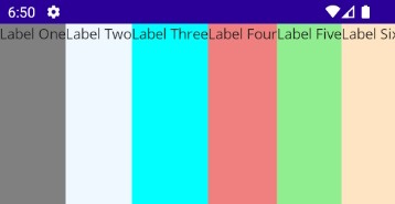
StackLayout with Horizontal orientation
Let’s change the orientation property of the StackLayout to ‘Horizontal’.
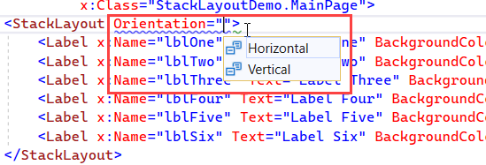
<StackLayout Orientation="Horizontal">
<Label x:Name="lblOne" Text="Label One" BackgroundColor="Gray"></Label>
<Label x:Name="lblTwo" Text="Label Two" BackgroundColor="AliceBlue"></Label>
<Label x:Name="lblThree" Text="Label Three" BackgroundColor="Aqua"></Label>
<Label x:Name="lblFour" Text="Label Four" BackgroundColor="LightCoral"></Label>
<Label x:Name="lblFive" Text="Label Five" BackgroundColor="LightGreen"></Label>
<Label x:Name="lblSix" Text="Label Six" BackgroundColor="Bisque"></Label>
</StackLayout>
After changing the orientation, all the child elements under the StackLayout are arranged horizontally.
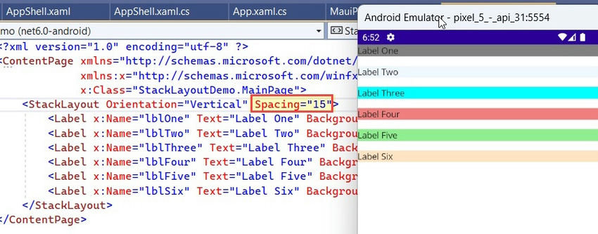
Spacing property in StackLayout
Another property of StackLayout is ‘Spacing’ which is of type double, and specifies the amount of space between the child views. Its default value is 0. For demonstration purposes, I am changing this value to 15.
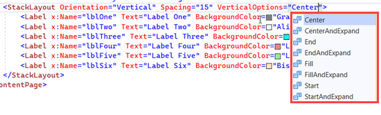
HorizontalOptions and VerticalOptions in StackLayout
The HorizontalOptions and VerticalOptions properties of the StackLayout are of type LayoutOptions and are used to specify how a view should be aligned or positioned within its parent layout when there is unused space available. In the below example, I am changing the VerticalOptions of the StackLayout to Center.
<StackLayout Orientation="Vertical" Spacing="15" VerticalOptions="Center">
<Label x:Name="lblOne" Text="Label One" BackgroundColor="Gray"></Label>
<Label x:Name="lblTwo" Text="Label Two" BackgroundColor="AliceBlue"></Label>
<Label x:Name="lblThree" Text="Label Three" BackgroundColor="Aqua"></Label>
<Label x:Name="lblFour" Text="Label Four" BackgroundColor="LightCoral"></Label>
<Label x:Name="lblFive" Text="Label Five" BackgroundColor="LightGreen"></Label>
<Label x:Name="lblSix" Text="Label Six" BackgroundColor="Bisque"></Label>
</StackLayout>
Preview
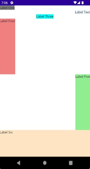
There are 8 Layout options (Center, CenterAndExpand, End, EndAndExpand, Fill, FillAndExpand, Start, StartAndExpand) that you can use in HorizontalOptions and VerticalOptions based on the layout you are planning to design. It is important to understand that the behavior of the horizontal options and vertical options can vary depending on the parent layout.
In the below example, I have changed the HorizontalOptions & VerticalOptions properties to demonstrate the position of the Label object position within the StackLayout.
<StackLayout Orientation="Vertical" Spacing="15">
<Label x:Name="lblOne" Text="Label One"
BackgroundColor="Gray"
HorizontalOptions="Start"></Label>
<Label x:Name="lblTwo" Text="Label Two"
BackgroundColor="AliceBlue"
HorizontalOptions="End"></Label>
<Label x:Name="lblThree" Text="Label Three"
BackgroundColor="Aqua"
HorizontalOptions="Center"></Label>
<Label x:Name="lblFour" Text="Label Four"
BackgroundColor="LightCoral"
HorizontalOptions="Start"
VerticalOptions="FillAndExpand"></Label>
<Label x:Name="lblFive" Text="Label Five"
BackgroundColor="LightGreen"
HorizontalOptions="End"
VerticalOptions="FillAndExpand"></Label>
<Label x:Name="lblSix" Text="Label Six"
BackgroundColor="Bisque"
VerticalOptions="FillAndExpand"></Label>
</StackLayout>
Preview
Nested StackLayout Objects
We can create complex UI Structures by using nested StackLayout objects. In the below example, I have used the combination of Vertical and Horizontal orientation, as well as the nested StackLayout.
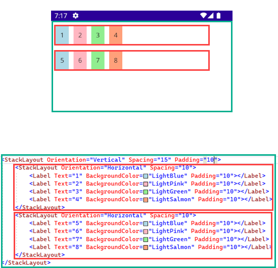
<StackLayout Orientation="Vertical" Spacing="15" Padding="10">
<StackLayout Orientation="Horizontal" Spacing="10">
<Label Text="1" BackgroundColor="LightBlue" Padding="10"></Label>
<Label Text="2" BackgroundColor="LightPink" Padding="10"></Label>
<Label Text="3" BackgroundColor="LightGreen" Padding="10"></Label>
<Label Text="4" BackgroundColor="LightSalmon" Padding="10"></Label>
</StackLayout>
<StackLayout Orientation="Horizontal" Spacing="10">
<Label Text="5" BackgroundColor="LightBlue" Padding="10"></Label>
<Label Text="6" BackgroundColor="LightPink" Padding="10"></Label>
<Label Text="7" BackgroundColor="LightGreen" Padding="10"></Label>
<Label Text="8" BackgroundColor="LightSalmon" Padding="10"></Label>
</StackLayout>
</StackLayout>
Implementing StackLayout using C#
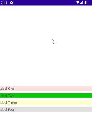
In all the above examples, I have designed the layout using the XAML. Now let’s see How we can achieve the same using the c#. For demonstration purposes, I am creating a Simple StackLayout containing multiple Labels.
public partial class MainPage : ContentPage
{
public MainPage()
{
InitializeComponent();
StackLayout stackLayout = new StackLayout()
{
Orientation = StackOrientation.Vertical,
VerticalOptions = LayoutOptions.Center,
Spacing = 10
};
stackLayout.Add(new Label() { Text = "Label One", BackgroundColor = Color.FromRgb(255, 225, 225) });
stackLayout.Add(new Label() { Text = "Label Two", BackgroundColor = Color.FromRgb(0, 204, 0) });
stackLayout.Add(new Label() { Text = "Label Three", BackgroundColor = Color.FromRgb(255, 255, 204) });
stackLayout.Add(new Label() { Text = "Label Four", BackgroundColor = Color.FromRgb(224, 224, 224) });
Content= stackLayout;
}
}
Preview
There are two other Layouts, i.e., HorizontalStackLayout and VerticalStackLayout, which are more performant alternatives to the StackLayout. However, implementation-wise, they are quite similar to StackLayout. To learn more about them, you may refer to the official Microsoft documentation.
European best, cheap and reliable ASP.NET hosting with instant activation. HostForLIFE.eu is #1 Recommended Windows and ASP.NET hosting in European Continent. With 99.99% Uptime Guaranteed of Relibility, Stability and Performace. HostForLIFE.eu security team is constantly monitoring the entire network for unusual behaviour. We deliver hosting solution including Shared hosting, Cloud hosting, Reseller hosting, Dedicated Servers, and IT as Service for companies of all size.